

New interactive dashboard shows COVID-19 risk, data trends in Michigan
(FOX 2) - A new, interactive dashboard launched in Michigan Tuesday that shows real-time regional and county-specific data on COVID-19.
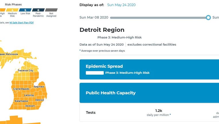
The dashboard separates Michigan into eight regions and provides data like tests, cases and deaths for each region. A risk phase is also given for each area, ranging from uncontrolled growth to post-pandemic. The risk phases correlate with the six phases in Gov. Gretchen Whitmer's 6-step MI Safe Start Plan.
The dashboard shows data like percentage of positive tests, the number of tests being administered, the number of new cases and the number of new deaths both by region or more specifically by county. Graphs, numbers and trends provide a snapshot of how much virus is in a community, and whether it is increasing or decreasing.
Right now two areas in Michigan are in medium risk, or Phase 4. That's the Upper Peninsula and the Traverse City region, where some restrictions have already been loosened. All other areas are in a medium-high risk, or Phase 3.
Gov. Whitmer said Tuesday in her press briefing that she hopes this dashboard gives Michiganders general insight into some of the indicators that have affected public health decisions, as well as being a useful tool for guiding the choices made.
Officials advise those living in higher risk areas adhere to stricter social distancing and advise those who may be more vulnerable to COVID-19 complications take greater precautions.
The dashboard was developed through a collaboration between the Michigan departments of Health and Human Services and Labor and Economic Opportunity and the University of Michigan.
The dashboard, designed and created by faculty at U-M School of Information and School of Public Health, presents risk and capacity indicators that inform implementation of the MI Safe Start Plan. These indicators fall into three categories: epidemic spread, health system capacity and public health capacity. Each indicator displays a level of risk.
These indicators, along with other epidemiologic information, inform the overall risk level for a region. It also incorporates on-the-ground knowledge, such as whether new cases of COVID-19 are localized to a single outbreak or represent communitywide spread.
Risk levels were developed by MDHHS and the U-M School of Public Health using guidance from the Centers for Disease Control and Prevention, national Guidelines for Opening America and several other leading national organizations.
The eight regions the dashboard shows are known as the Michigan Economic Recovery Committee (MERC) regions. MERC regions were developed by merging Michigan's Emergency Preparedness Regions and Michigan's labor sheds - the major areas of the state where people live and travel to work based on U.S. Department of Labor data - so that any outbreak resulting from a return to work could be handled effectively under public health laws.
You can visit the dashboard at www.mistartmap.info.